Gabriele Nicola Website
Creating a Multilingual Website and Brand Identity for an Emerging Italian Conceptual Artist
Masa Wu: Team Leader, Scrum Master, Market Research, Image Editing, Wireframes, Design and Prototyping, Customer Journey, SVG Animation, Storyboard & Video Editing
Larisa Ailisoaie: Moodboard, Personas, Conducting User Testing, Card Sorting Test, Writing Database
Yan Li: Wireframes and Prototyping, Business Documentation, User Test Analysis, Front-end and Back-end Development, SEO
Chiara Nicola: Sender Analysis, Competitor Analysis, Customer Journey, Interviews, Bert Test, Translations, Image Editing, Video Editing
Giada Ferrari: Front-end Development, Flow Charts, Language Translations, Business Report, Proofreading Web Content
Problem
Gabriele Nicola, a young sculptor from Italy, approached us to establish his brand identity, create a website, and produce a promotional video for his kinetic art.
Solution
We faced the challenge of building an online presence for Gabriele, who had recently graduated and lacked visibility as an artist. Our solution involved crafting a website and brand that aligned with Gabriele's values and appealed to art buyers and gallery owners. This platform aimed to establish Gabriele's credibility, connect with his social media followers, reach a global audience, promote art sales, and inform his followers about upcoming exhibitions and events. Given the dynamic nature of his work, we incorporated a video to showcase the narrative behind his art.
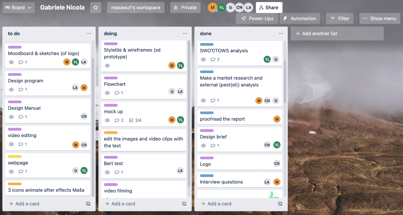
I employed Trello as a Kanban chart to prioritize daily tasks and meet deadlines efficiently. Trello facilitated the creation of task lists, assigning responsibilities, and visually representing individual and collaborative workloads. Tasks were ranked by priority, with top tasks often serving as prerequisites for subsequent ones. As the Scrum master, I oversaw daily stand-up meetings to monitor progress, allocate or reassign tasks as necessary, and motivate the team to meet deadlines.
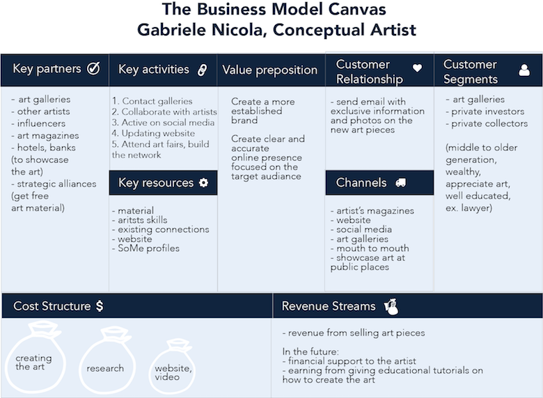
The Business Model Canvas served as a visual overview of the brand and guided us in exploring fundamental questions about the art market and the artist. It helped us define the artist's mission, vision, values, and identify customer segments, which were later refined into detailed personas.
Furthermore, we conducted surveys, interviews, and engaged with existing art buyers and gallery owners to gain insights into the industry and its demands.
Identifying key personas informed our design decisions and facilitated more accurate testing feedback from the target market. We developed three distinct personas:
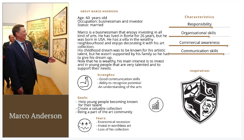
Marco - The Art Buyer: Inspired by existing clients, Marco seeks business opportunities and potential in emerging artists.
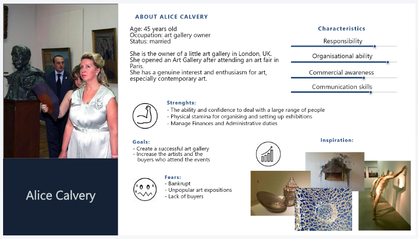
Alice - The Gallery Owner: Alice is a key investor and genuine enthusiast of conceptual art. She follows artists on social media and values website presence for credibility.
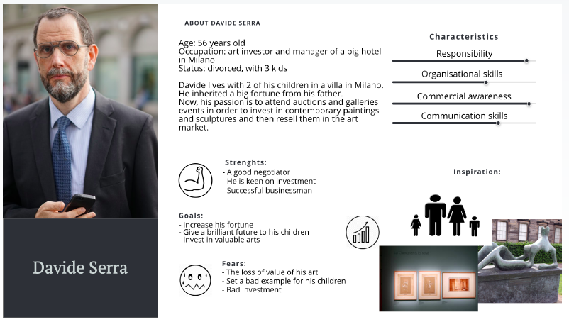
Davide - The Art Collector: Seeking emotional connections with art, Davide differs from typical art buyers by emphasizing personal resonance over investment.
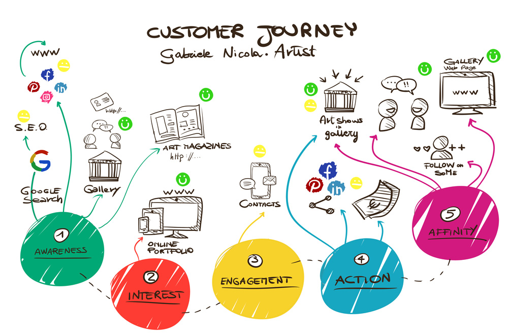
Understanding how personas discover the artist and his art allowed us to empower them to engage and promote Gabriele. Key personas could learn about Gabriele through art gallery exhibitions, online searches, and articles in art magazines. The website's robust SEO was vital for online discovery. We ensured seamless navigation between social media channels and the website. The goal was to create affinity, motivating art buyers and gallery owners to promote Gabriele's work through word of mouth and social media.
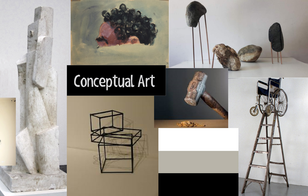
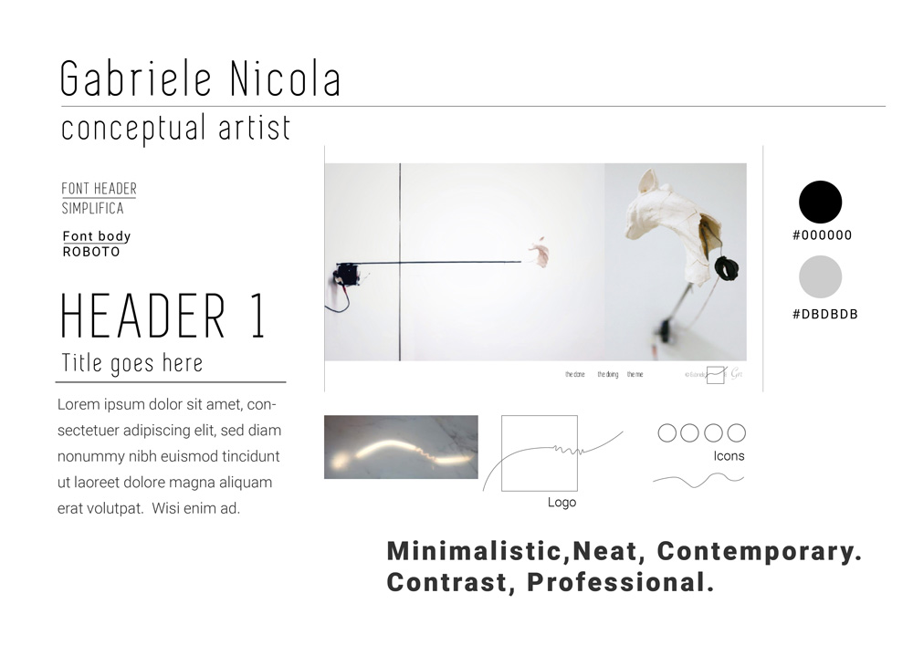
Moodboards, style tiles, and early interviews inspired and guided us to create a consistent style aligned with the client's objectives. Moodboards helped us establish a visual foundation for conceptual art. We developed two style tiles based on competitor analysis and the materials used in Gabriele's art, drawing from warm, natural tones found in his work.
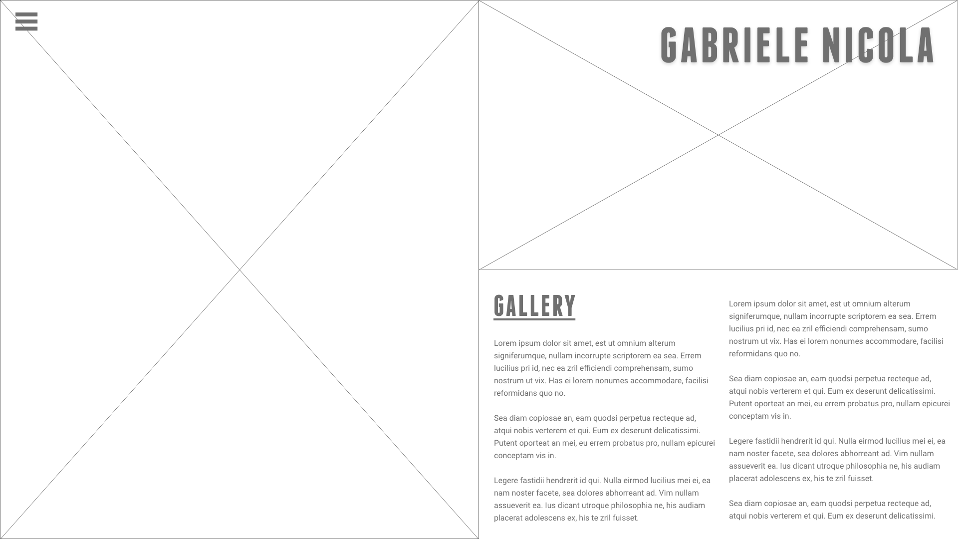
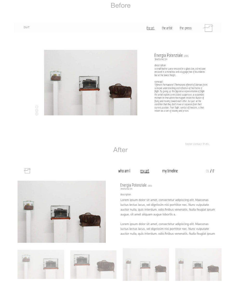
We presented two wireframe designs to the artist, confirming our grasp of essential information. These wireframes dictated content layout and were shown to the artist to gather feedback on layout and structure. After receiving feedback, we created high-fidelity prototypes for further testing.
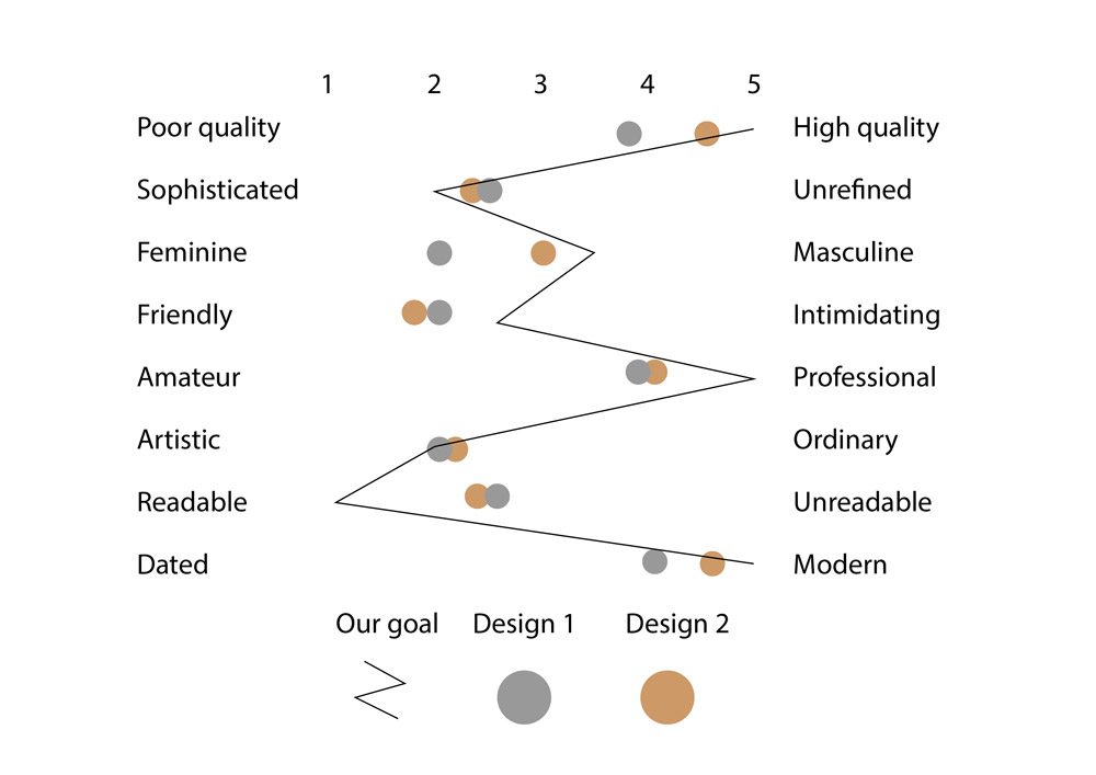
We conducted the BERT test that measured subjective opinions about the perception of each proposed designs. We showed design A to the first test group and ask them to rate the key objectives. At the same time we share the design option B with and measured it's performance. We summarized the results in a single chart seen on the right showcasing that both designs were accepted positively and close to desired outcome. Nevertheless, design 1 did outperform the Design 2 resulting in going ahead and further user testing and redesigning Design 1 which at the end became the final solution.
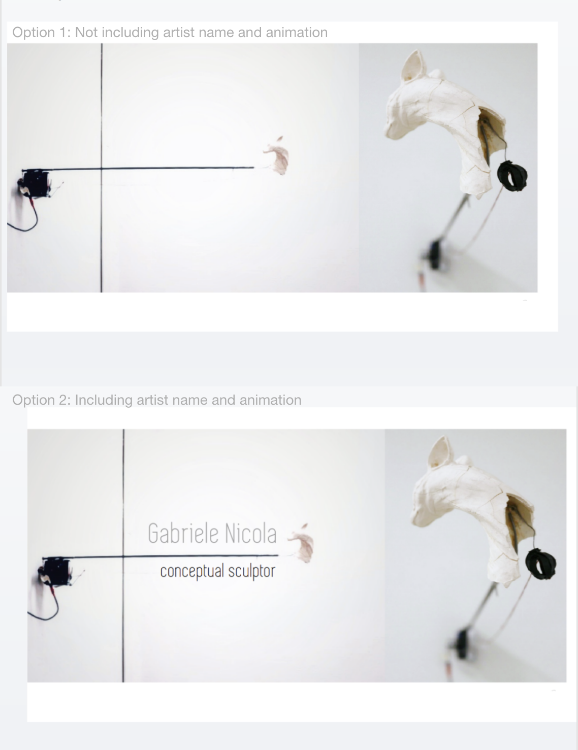
We conducted interviews with three art galleries ranging from small to large at relatively prime locations. We asked about adding the artist’s name with his professional title to the homepage and including the animation effect showing the movement of the art.
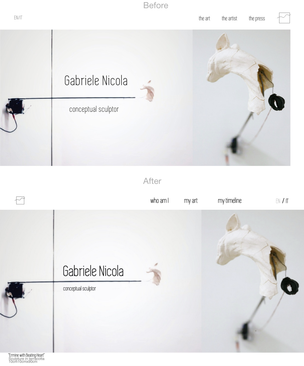
Regarding whether or not to include the artist name and wording “conceptual sculptor” on the landing page , two interviewers commented that without the artist name, they were not completely sure what this site was about. When asked directly if the artist name should be included on the homepage, their immediate answer was 'yes!'.
The animation was considered interesting and pleasant. One interviewer suggested that it would be better to make it clear that the animation is showing the actual movement of the art piece, not just an effect on the website.
Overall the interviewers thought the design with artist's name and movement created a better impression of an artist’s website and one interviewer guessed it was about conceptual art. The prototype with the name and the movement was generally perceived as more professional and cleaner. It was the preferred design by all testers.
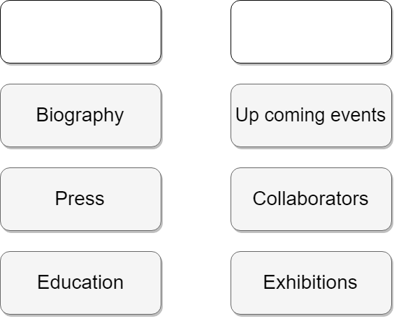
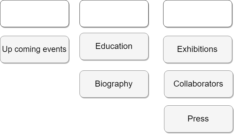
Navigation labels were revised based on testing feedback. We aimed to convey a unique and artistic vibe while ensuring clarity.
First draft: “the done” “the doing” “the me” “the press”
Pros: It is artistic and works well in Italian language.
Cons: It is grammatically incorrect in English, many testers found it confusing and misleading.
Second design: “the art” “the artist” “the facts”
Pros: Simplicity due to moving 'the doing' from the website to the social media. Gestalt law of similarity by using a similar phrase structure.
Cons: “The artist” sounds less personal and “The facts” is perceived cold and technical.
Third design: “my art” “who am I” “my journey”
Pros: It gives website a more personal feel.
Cons:Testing revealed “My journey” is confusing. Testers thought “who am I” and “My journey” contain the same content.
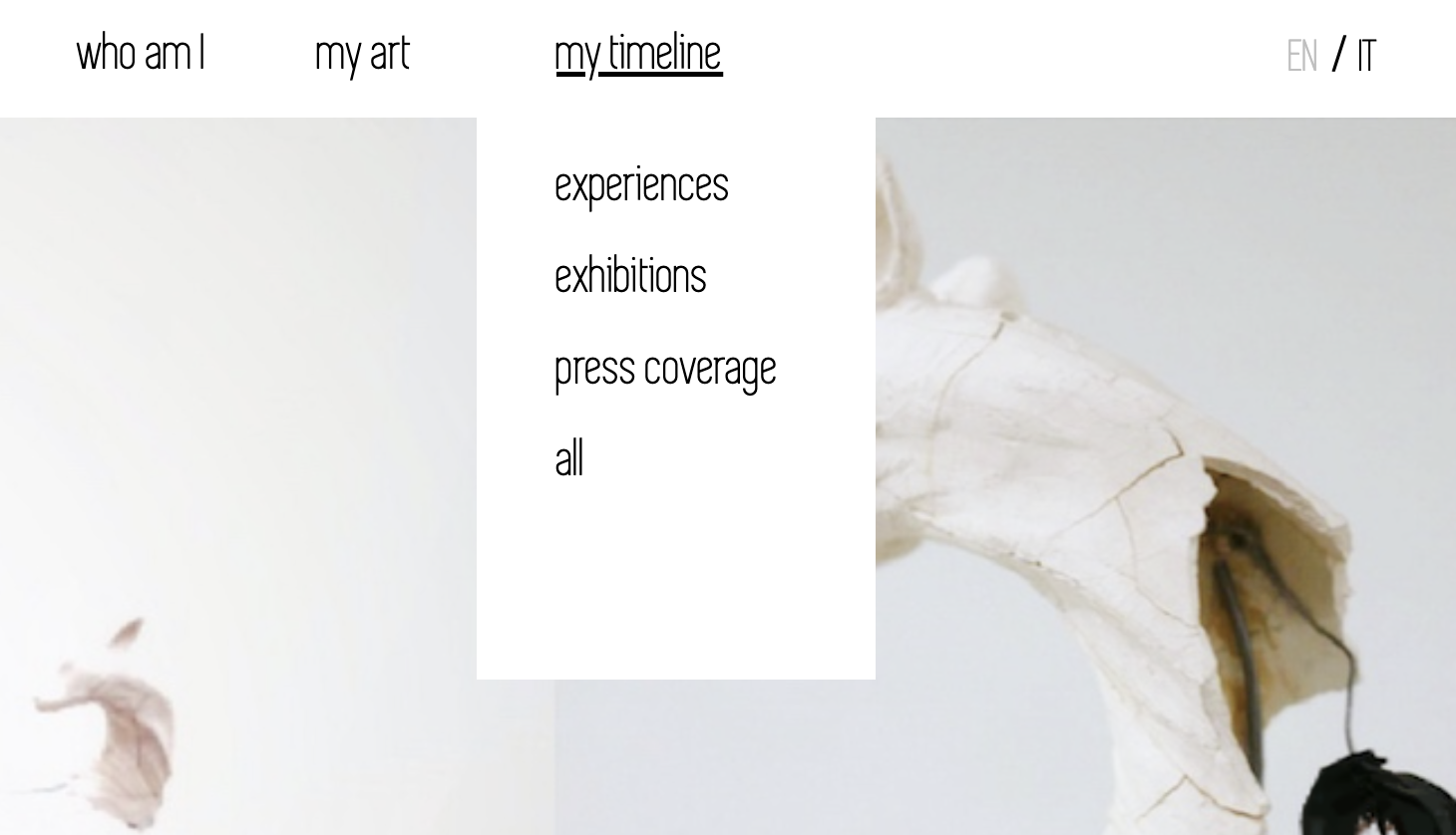
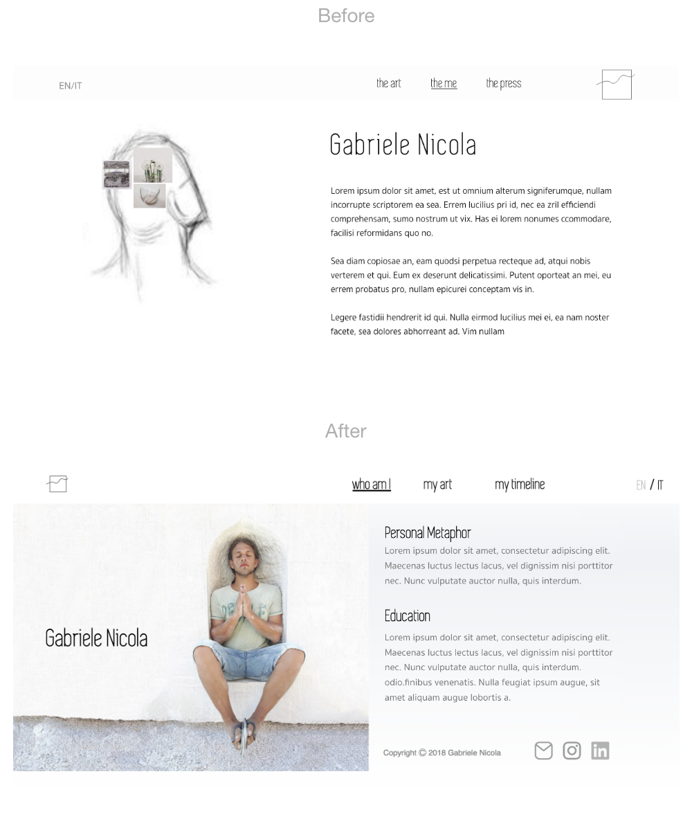
Final choice: “my art” “who am I” “my timeline”
We performed an online research and got inspired by a competitors website calling the section "timeline". To add personal note and consitency we decided to call it “my timeline”.
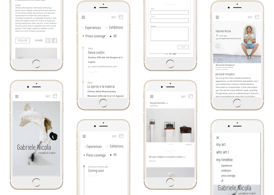
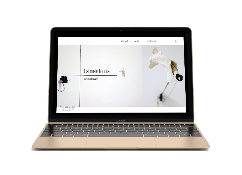
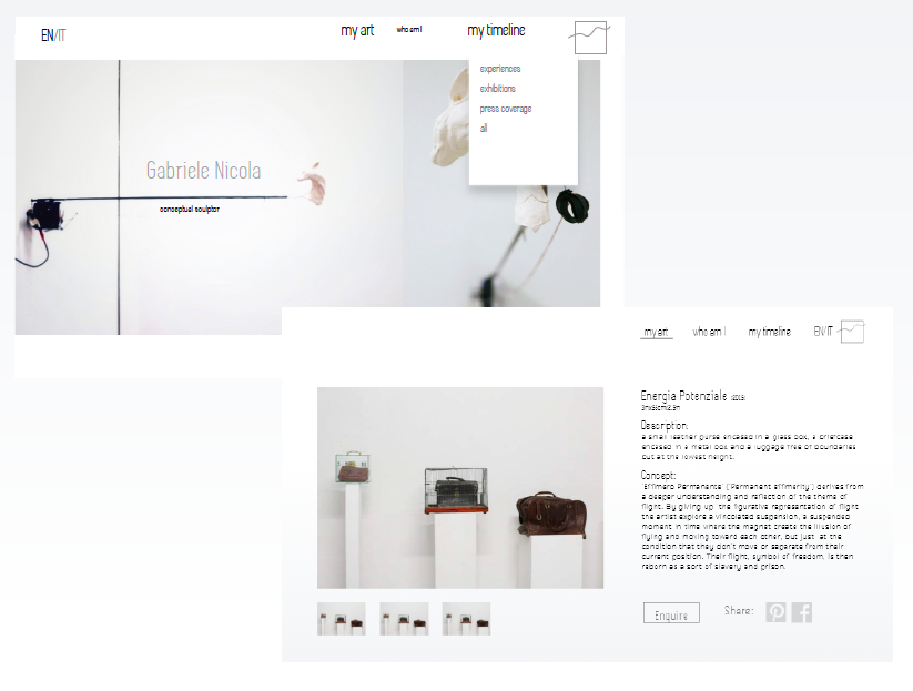
Home
BERT tests and interviews lead us to redesign the homepage to include artists name and animation. At the bottom left we added a small descriptions about the art piece to communicate to the website visitor that they are looking at the artist's moving art.
Based on trunk test results and majority of the testers not being able to complete the task of navigating back to the homepage we decided to move the logo to the top left side of the page, which we learned during the testing to be a more conventional placement for a logo that acts as navigation element.
Based on the final navigation test results we updated the navigation labels.
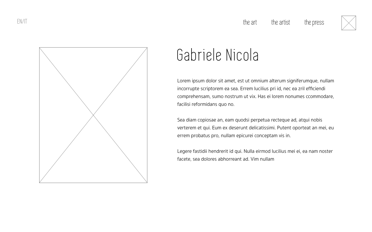
About
From the interviews with gallery owners we learned they like to follow artists on their social media. For this reason we first included the social media links to the gallery page. During the testing testers feedback was that they consider social media as contact information which they would expect to find in the footer area of about page.
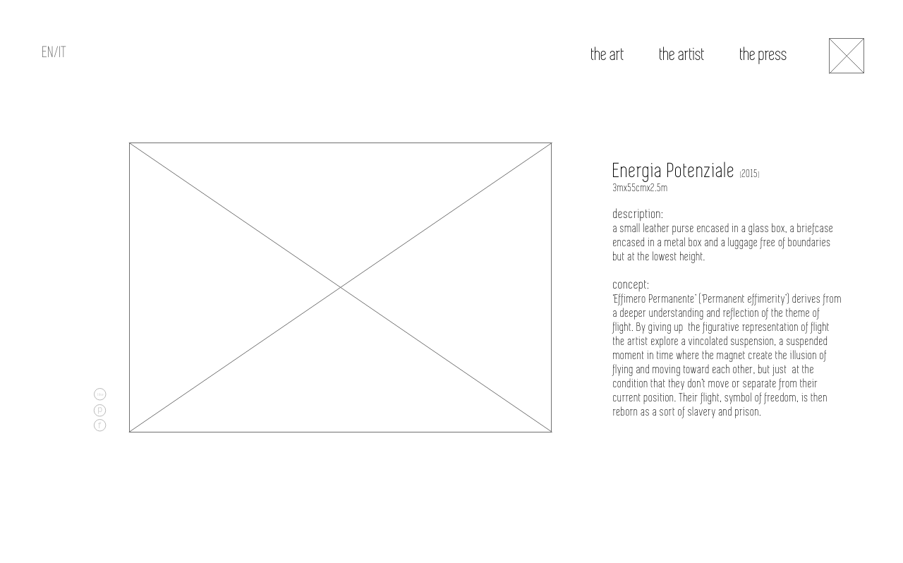
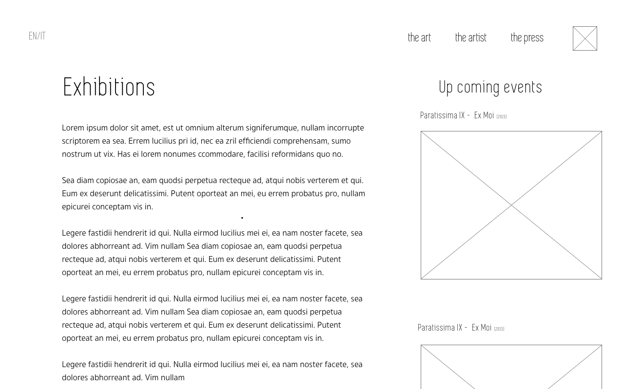
Gallery
The feedback collected via interviews showed that the information about each art piece proved particularly important. Because art buyers and gallery owners would like to learn as much as possible about the art we include a carousel with additional art photos taken from various angles.
Since busy art buyers and gallery owners can learn about the artist at gallery exhibitions and would want to look up the artist right away, it was important that the website resizes and displays well on the mobile.
The goal of the mobile solution was to be consistent with the web solution, consisting of the home, about, and timeline page. The most noticeable difference between the mobile and the desktop version is that in the mobile we displayed only single image per art with the ‘more’ button which redirects to the page with more information and additional images.