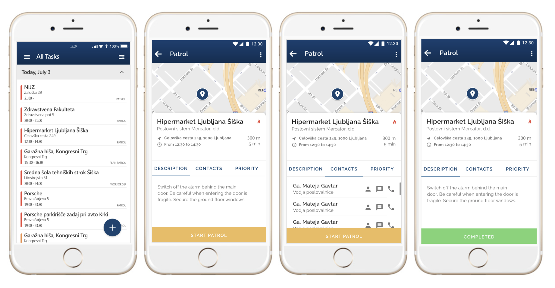
Patrol Mobile App
Designed a mobile app for security officers to manage patrols, enhancing efficiency and providing management with real-time visibility
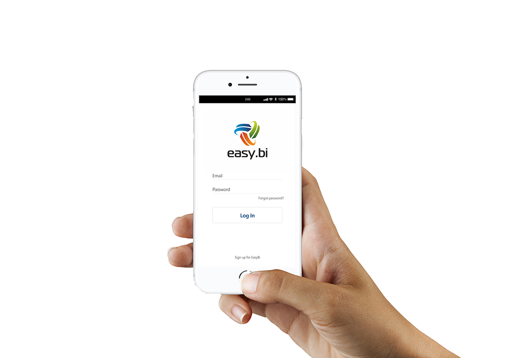

Transformed security office scheduling from manual, rigid spreadsheets to a dynamic, interactive digital system, enabling real-time updates and improved communication with security guards.
As the sole UX/UI designer, I led the end-to-end design process: conducting competitor and user research, brainstorming with stakeholders, developing user personas and style guides, creating sketches and the final UI design, and prototyping site maps.
Problem:
• Static schedules lack flexibility to adapt to changing client needs.
• Lack of visibility makes it difficult to verify patrol progress and completion.
Solution:
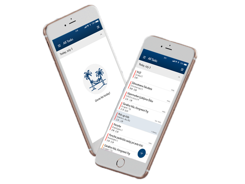
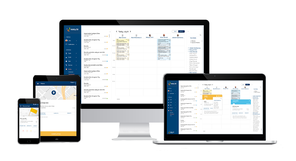
• Mobile/desktop app system for dynamic scheduling and task management.
• Managers plan schedules and create patrols on the desktop.
• Guards receive and complete scheduled patrols on the mobile app.
• Real-time progress tracking for enhanced visibility and accountability.
I initiated collaborative brainstorming sessions with the company owner and my manager to define the product vision and align on market needs. We explored diverse ideas and sketched potential solutions. This process laid a strong foundation for the subsequent user research phase.
Key Activities:
• Whiteboard brainstorming sessions to generate and refine ideas
• Feature prioritization to align with user needs and business goals
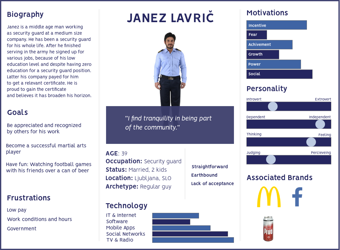
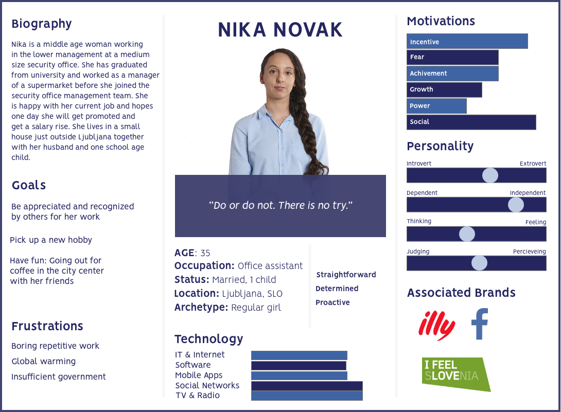
Based on the analysis of daily schedules, I developed personas to ensure that the design addressed their specific needs and goals.
Security Guard Janez
• Works in the field and uses the Patrol Station mobile app
• Primarily responsible for completing assigned patrols
• Goals: Efficiently manage daily tasks and patrol routes, stay informed about schedule changes or updates in real-time, easily report incidents, hazards, or suspicious activity.
Patrol Planner Nika
• Works in the security office and occasionally in the field, uses both desktop and mobile app
• Primarily responsible for scheduling and tracking patrols
• Goals: Efficiently schedule security guard shifts, easily track patrol progress and completion in real-time, quickly adapt schedules to changing client needs or incidents.
I efficiently translated our brainstorming session ideas into tangible form through hand-drawn sketches. These lo-fi prototypes allowed us to visualize and explore various design concepts early on, fostering collaboration and alignment within the team.
The following day, I presented the sketches to the project stakeholders (manager and founder) and developers. The informal nature of pencil sketches encouraged open discussion and iteration, leading to valuable refinements.
Involving the developers in this early stage helped them understand the design vision and provide realistic estimates for development times. This collaborative approach ensured that our design solutions were not only user-centric but also technically feasible.
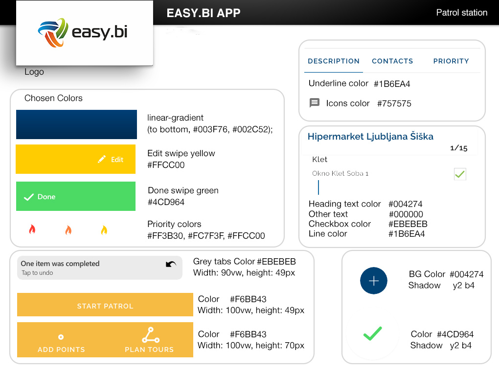
To ensure consistency across platforms, I created a comprehensive style guide defining typography, color palettes, and iconography. This served as a single source of truth for developers, streamlining implementation and maintaining brand alignment.
Typography: I carefully selected fonts that communicated professionalism and clarity, optimizing readability for both mobile and desktop interfaces.
Color Palette: A high-contrast color palette was developed, leveraging blue for trust and professionalism, and yellow for quality and engagement. This palette ensured visual appeal and accessibility.
Iconography: I designed a set of custom SVG icons and generated an icon font using Icomoon, making it easy for developers to integrate and style icons within the app.
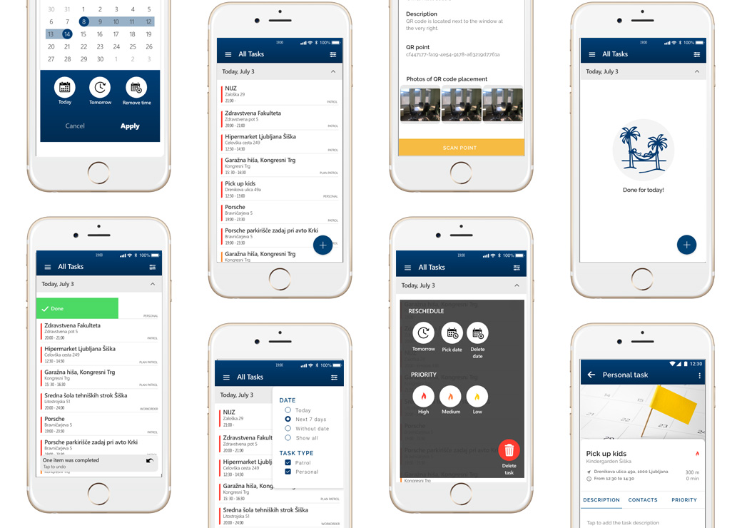
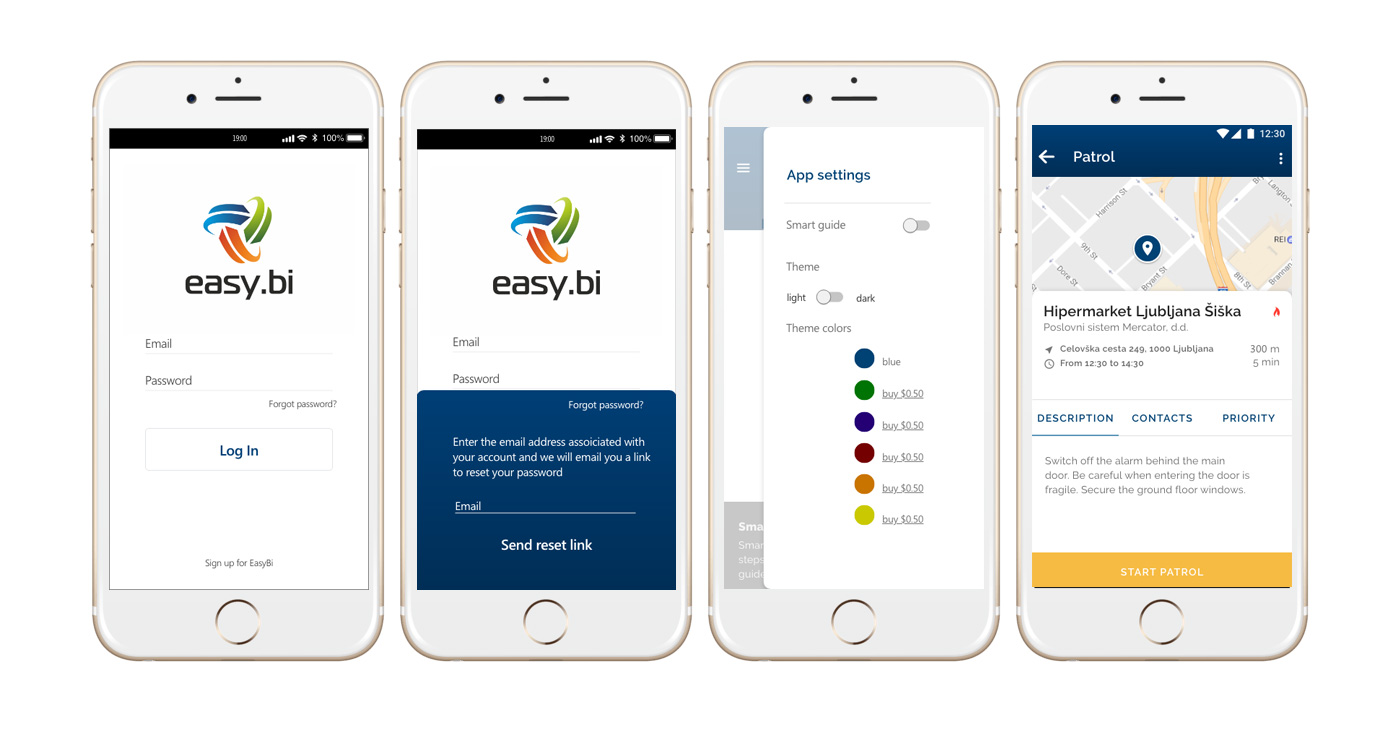
The final prototyping phase was conducted in Sketch and Adobe XD, producing the high-fidelity mockups. These designs were iteratively refined based on valuable feedback from stakeholders, team members, and, most importantly, end users.
A key example of user-centric design is the implementation of light and dark app themes. Interviews with security guards highlighted the need for visual comfort during both day and night shifts. This insight led to the development of distinct light and dark themes, easily toggled for optimal readability and user experience.
The high-fidelity prototypes served as a communication tool for developers, ensuring accurate implementation of the design vision. They also facilitated user testing, validating my design decisions and uncovering areas for further improvement.
This iterative process ensured that the final product not only looked polished but also effectively addressed user needs and preferences.

By incorporating stakeholder and user feedback, I developed site maps outlining key user journeys within the app. These visual representations clarified the purpose behind various buttons and illustrated the interconnectedness of different screens.
Introducing site maps as a new process at easy.bi proved highly beneficial for developers. It streamlined their workflow, providing a comprehensive overview of app functionalities. This newfound clarity fostered a deeper understanding of the design intent and user experience goals, ultimately contributing to a more successful development process.
Patrol Station exemplifies the transformative power of user-centric design in security operations. By prioritizing user needs and incorporating feedback throughout the process, we delivered an app that empowered guards, improved communication, and enhanced operational efficiency.
This success highlights the value of collaboration and user-centricity in driving positive organizational change.
