Huset
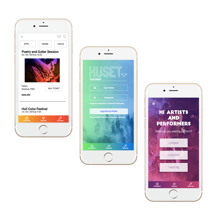
Co-designed a mobile app that helps event seekers book events, volunteers manage their schedule, and artists reserve venues
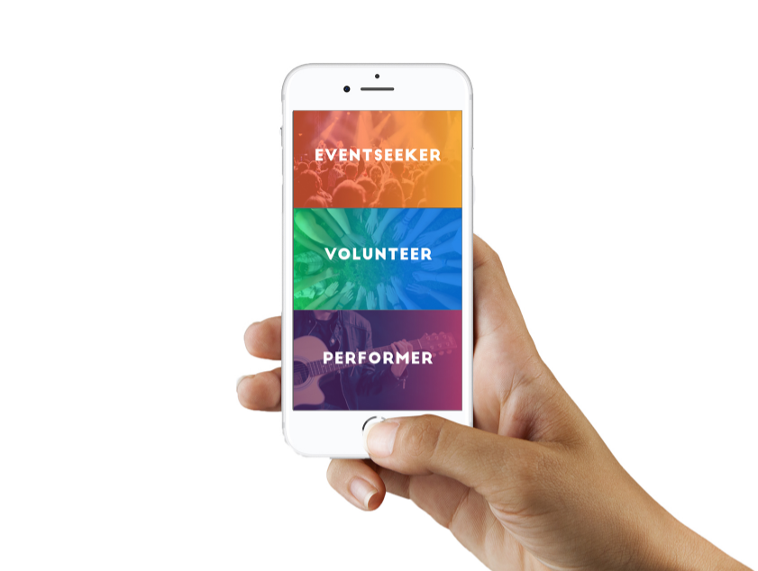

Co-design a comprehensive mobile app for Huset, enabling seamless interactions among event seekers, volunteers, and performers. In just two weeks, our team aims to transform Huset's user experience by crafting distinct personas, building intuitive interfaces, and optimizing information architecture. The Huset app will enhance user engagement by simplifying event booking, managing volunteer schedules, and reserving venues for artists.
• Masa Wu: Performer persona, design guide/manual, prototyping, user testing, IA, performer app design/development, SEO
• Chiara Nicola: Volunteer persona, design guide/manual, prototyping, user testing, IA, volunteer app development
• Giada Ferrari: Event seeker persona, design guide/manual, prototyping, user testing, IA, event seeker app development
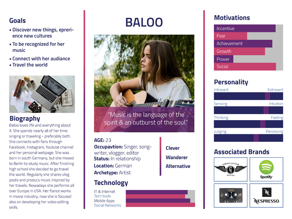
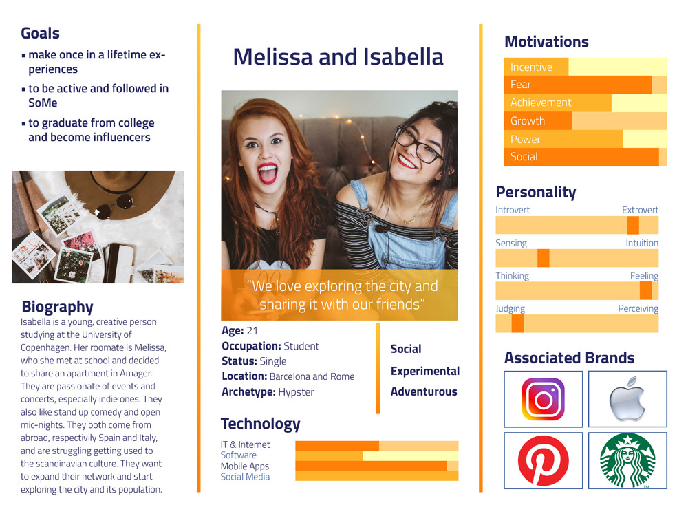
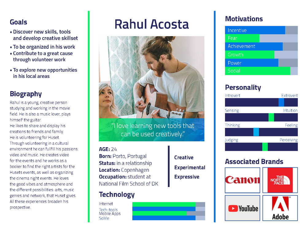
The personas were inspired by real users of Huset, focusing primarily on an international audience.
Performer: This persona can be a single artist, a complete band, or even a theater crew. They may be up-and-coming or established artists looking to book and perform at one of Huset’s venues.
Event Seeker: This persona attends Huset’s events, which range from vibrant underground and alternative music scenes to film screenings and theater shows, often accompanied by a glass of wine.
Volunteers: These individuals form the backbone of Huset. They manage bars, handle tickets, organize events, and contact performers and actors to set up future collaborations.
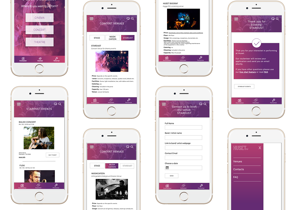
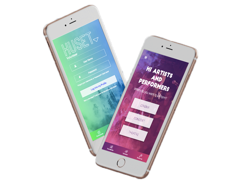
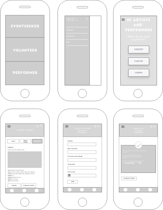
The layout of the phone demonstrates the key user interface elements used in the performer platform of the app. Before starting the process, I first determined the goals, scope, and future vision for the app.
We spent considerable time discussing design and layout options, followed by sketching various possibilities to ensure that all three apps adhere to a unified design layout.
The final wireframe design was informed by outlining the information architecture and defining user flows using card sorting tests. These UX methodologies significantly helped us identify key layouts and interaction patterns.
To ensure the best usability, findability, and engagement, we followed a process of planning and defining the app's structure. Each of us focused on the information architecture for our respective personas within the app, then regrouped to define how all three parts of the app would merge.
We first organized our web app structure in a hierarchical model. By placing the user at the center of our design process, we learned how users interact with the navigation and respond to the content organization. We later tested our model through card sorting tests followed by interviews.
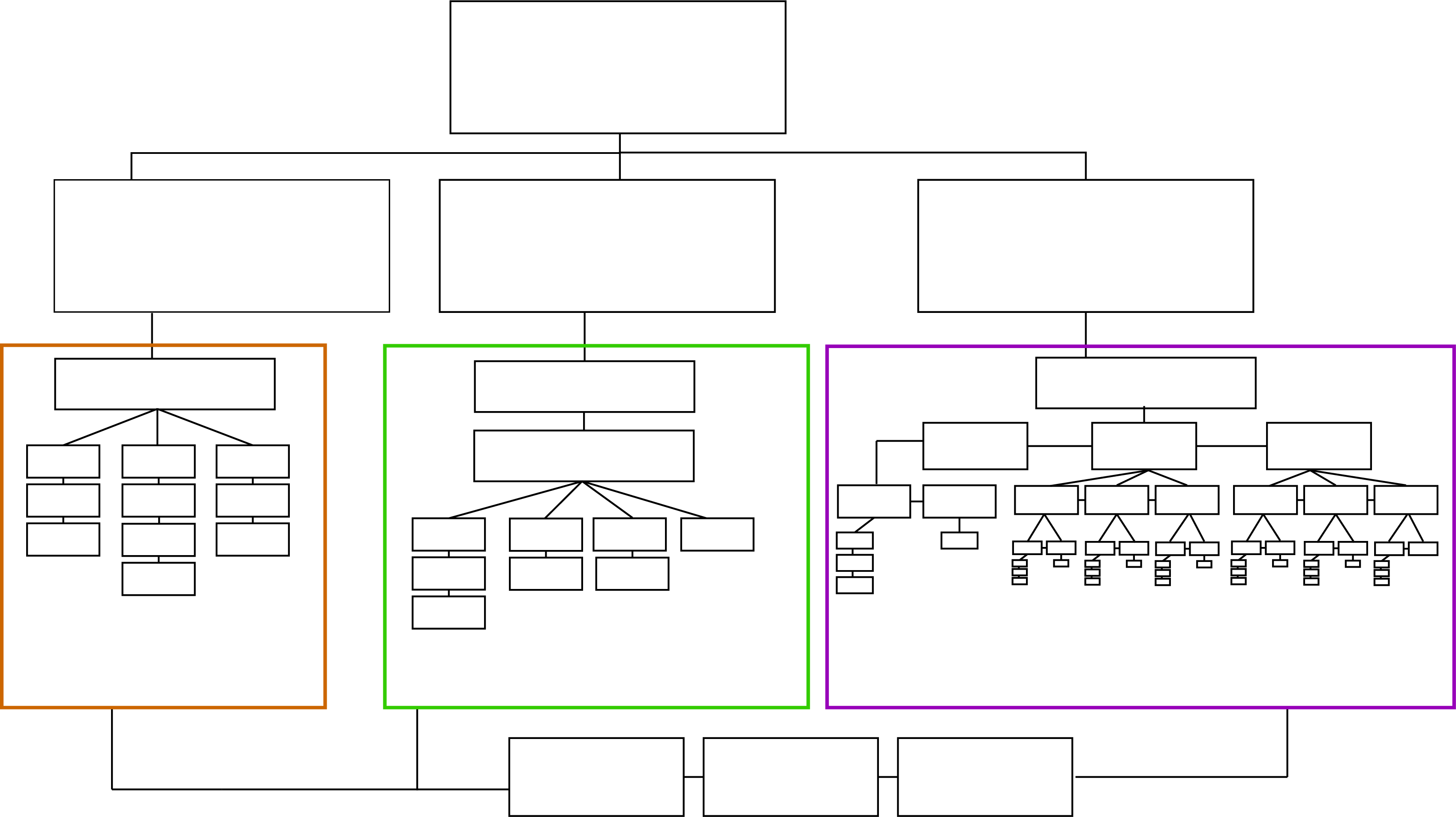
We performed card sorting tests with five different users in two rounds.
The first card sorting test showed that users were confused by our choice of the three main navigation categories: Events, Performers, and Volunteers. While they understood the personas behind Performers and Volunteers, they couldn’t connect the persona behind Events. Performers and Volunteers referred to people, whereas Events referred to a subject. Our solution was to rename Events to Eventseekers.
In the second card sorting test, I focused on the performer app. It revealed that the main burger navigation could be simplified. Instead of giving users the option to choose between concert, theatre, and cinema venues in the burger menu, it made more sense to direct them back to a screen with all the venues, where they could filter based on their venue of interest.
This approach improved usability and consistency across the three apps. For example, in the Eventseeker section, we also link to events and offer filtering functionality. Maintaining consistent navigation functionality throughout the mobile app enhances the overall user experience.
We prepared a design booklet consisting of business goals, user test reports, and visual design guidelines.
In the design brief, we defined business goals such as the mission, vision, and values for the new Huset app. We user-tested the existing Huset website and decided which elements to reuse. For user testing, we conducted think-aloud tests, asking users to verbalize their thoughts as they navigated through the app's interface.
In the design program, we described and justified decisions about the chosen logo, colors, and typography.
The design process gives insights into our design steps and workflow. We started with low-fidelity prototypes, such as sketches and wireframes, and prepared a style tile with specific design guidelines. We then conducted card sorting tests to help us define the best navigation choices and set up the information architecture. Finally, we designed high-fidelity clickable XD prototypes and design mock-ups.
The design manual serves as a resource where designers and developers can look up defined color codes, typography specifications, and descriptions of icons and buttons.
User-Centric Design: Developed personas based on real Huset users, focusing on an international audience to ensure a broad appeal and relevance.
Collaborative Effort:Collaboration was key in this project as it allowed us to leverage the diverse expertise and perspectives of our team members, resulting in a more comprehensive and user-friendly app.
Iterative Design Process: Employed card sorting tests to refine navigation and improve usability, resulting in a cohesive and intuitive app experience.
High-Fidelity Prototypes: Created and tested interactive prototypes, allowing us to perfect the app’s design and functionality before final development.
Consistent and Modern UI: Established a new brand identity for Huset, retaining only the logo negative from the existing brand, and introduced a vibrant, high-contrast design for easy navigation.
